Welcome to the Treehouse Community
Want to collaborate on code errors? Have bugs you need feedback on? Looking for an extra set of eyes on your latest project? Get support with fellow developers, designers, and programmers of all backgrounds and skill levels here with the Treehouse Community! While you're at it, check out some resources Treehouse students have shared here.
Looking to learn something new?
Treehouse offers a seven day free trial for new students. Get access to thousands of hours of content and join thousands of Treehouse students and alumni in the community today.
Start your free trial
kami
Courses Plus Student 6,825 PointsThe grid layout doesn't look right in the browser
The code works fine, but the layout in the browser doesn't look right. The buttons in the middle column are not being aligned properly. Is the code outdated?
3 Answers
kami
Courses Plus Student 6,825 PointsYeah, there's nothing wrong with the code. I just realized that I need to give the buttons a margin-top property and set it to auto. That would pin the buttons to the bottom regardless of the content length. That would make them look neater.
kami
Courses Plus Student 6,825 PointsGreat, thanks so much! I use Google Chrome for this. Here's the link I worked on: https://teamtreehouse.com/library/the-solution-24 and my code: https://w.trhou.se/m5j09kd1yy
Brandon White
Full Stack JavaScript Techdegree Graduate 35,773 PointsHi Kami,
I forked your workspace, and everything looks perfect to me. At a certain point while resizing the browser, the buttons do seem off a little bit. I'm posting a picture below.
Is this what you're referring to?
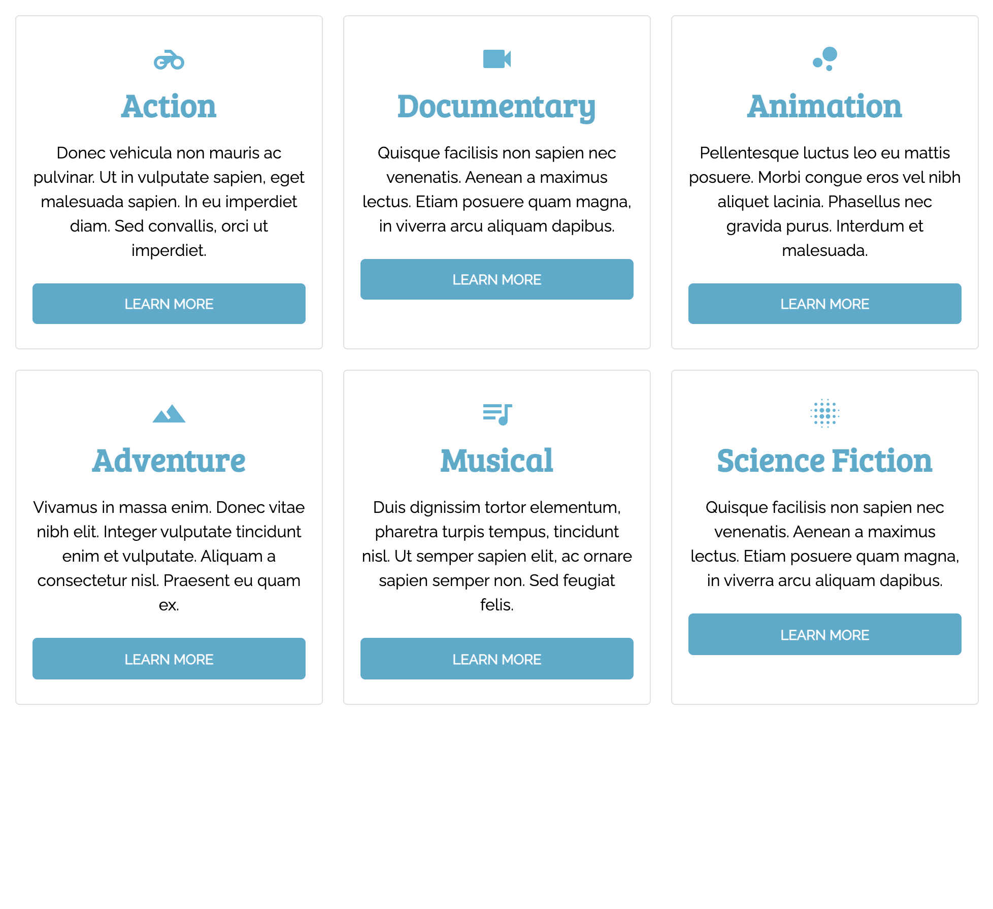
If so, there's nothing wrong with your code. The display: grid turns every direct child into a grid item. All of the divs with a class of card are grid items, but the elements nested within those cards are not grid items. They also aren't flexed, and so as the width of the screen gets smaller (or more narrow) the text in the cards is forced to wrap to another line on some of the cards (since they all have different amounts of text), which then pushes the corresponding button to a new line.
Hopefully, that clears things up for you. If that's not what you were referring to, or if you still need a little more guidance, let me know.
Brandon White
Full Stack JavaScript Techdegree Graduate 35,773 PointsBrandon White
Full Stack JavaScript Techdegree Graduate 35,773 PointsHi kami,
If your code is the same as the instructor's, it could be a differing in the sizes of your browsers potentially. If you wouldn't mind providing a link, both to your code and to the course you were working on, and I (or some other student) will take a look at it for you?