Welcome to the Treehouse Community
Want to collaborate on code errors? Have bugs you need feedback on? Looking for an extra set of eyes on your latest project? Get support with fellow developers, designers, and programmers of all backgrounds and skill levels here with the Treehouse Community! While you're at it, check out some resources Treehouse students have shared here.
Looking to learn something new?
Treehouse offers a seven day free trial for new students. Get access to thousands of hours of content and join thousands of Treehouse students and alumni in the community today.
Start your free trial
Patrick Son
10,954 PointstemperatureLabel not centering vertically within daily_list_item view in API 19.
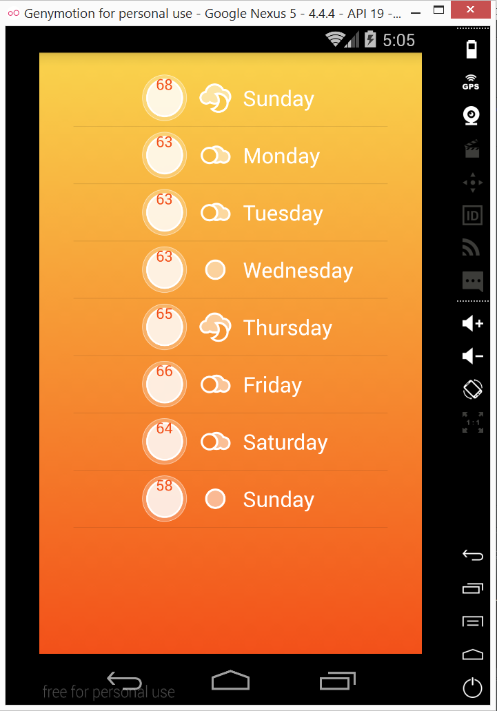
The project works fine on API 21, but when I run Stormy on my phone or in a 4.4.4 emulator, the temperatures are not centered vertically within each list item. I checked some other versions, and it seems to only happen in API 19. What could be the cause of this bug?
4 Answers
Luís Nabais
3,229 PointsThis was also hapening to me.
I found out that when a TextView has layout_width and layout_height set to wrap_content, you can make sure it is centered correctly by adding the following line to the TextView settings in the layout file:
android:layout_centerInParent="true"
Patrick Son
10,954 PointsThanks! That worked perfectly.
Phillip Hurst
4,204 PointsI too had this problem. I forgot to check the questions before sending feedback on video (see quote below). I went back and added android:layout_centerInParent="true" to the TextView and the layout was corrected.
Ran into a layout issue when I ran the app to the Genymotion Emulator: in the 'daily_list_item.xml' in the TextView for '@+id/temperatureLabel'... I ended up needing to add 'android:paddingTop="14dp"' in order to get the 'mTemperatureMax' to center on the '@+id/circleImageView'.
I tried to change the 'gravity' of the field to various constants, and tried to change the layout_align to the parent values instead of the imageView edges; all to no avail.
So I ended up just adding some padding - don't think this is optimal fix as it just bandaids an unknown problem. The IDE view looks fine; only when running to the emulator does it fault.
Any ideas? My code appears to match that in the lesson plan.
Thanks, Phillip
Antoine CHARLES
839 PointsPerfect !
rtrind
6,358 PointsThis answer is good but it's not perfect. At least on my emulator, the text is misaligned on some lines (and not on others).
I found out this is a bug on API 18+ and using the link below, I used the suggestion of wrapping the text inside a LinearLayout and use another strategy to center the label.
http://stackoverflow.com/questions/21444425/androidgravity-fails-on-api-18
With small modifications, my TextView became:
    <LinearLayout
        android:layout_width="wrap_content"
        android:layout_height="wrap_content"
        android:layout_alignTop="@id/circleImageView"
        android:layout_alignBottom="@id/circleImageView"
        android:layout_alignLeft="@id/circleImageView"
        android:layout_alignRight="@id/circleImageView"
        android:gravity="center">

        <TextView
            android:layout_width="wrap_content"
            android:layout_height="wrap_content"
            android:id="@+id/temperatureLabel"
            android:textColor="#f25019"
            tools:text="100"/>

    </LinearLayout>

jon1234
5,022 Pointsjon1234
5,022 PointsI had the same problem. First of all make sure to align the top and bottom of the circle image and the temperature label. That did not help for me, so I ended up adding a top padding to the temperature label to push it down. This is not really a solution to the problem. I just used it as a workaround because my phone is the only device this app will ever been installed on.